Austere Design, Forensic Photography
My brief was to showcase the meticulous record achieved in Paul Child’s architectural photography. His commission, to document everything from turn of the millennium dereliction to complete renewal, ending only after the station had re-opened in 2008.
He recounts how when asked the amount of his budget Channel Tunnel Rail Link’s response was: ‘just keep taking pictures’. So now the challenge was to include as many pictures as possible without over-crowding the book. Laurence King’s brief was to work within a strict ranged-left, ‘architectural’ grid with no bleeds.
Fonts
For the body a short text and Modernist layout pointed me towards a san serif, Helvetica Neue Condensed, throughout. For chapter titles, Stroudley, specially designed by Ron Carpenter for the new concourse signage, which exhibits all the best characteristics of a 19th-century grotesque font; the perfect compliment for Barlow’s muscular train shed engineering. For the jacket title, Didot, a refined Didone (Modern) face in common use when St Pancras opened for business in 1868.
The Cover
I chose this image for both the contrast and the connection between the two elements: Barlow’s blue and white gable end and George Gilbert Scott’s fairytale spires. In his delicate spiked crockets Barlow gives a nod from his ultra-modern iron and glass to Scott’s medieval-inspired brick and stone.
Example Spreads
-
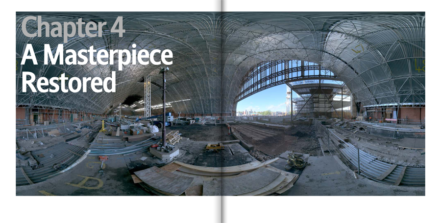
- 360 degree view, the whole train shed.
Click for more example spreads from chapter 4.
Example Spreads
-
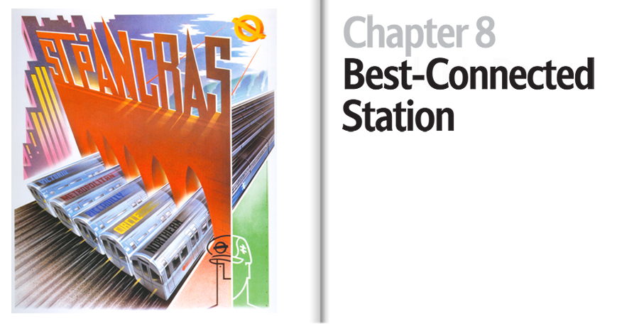
- 1960s poster advertising the fact that more Underground lines meet at St Pancras than at any other station.
Click for more example spreads from chapter 8.