
Verner Panton’s 1960 Stacking side chairs:
Laurence King’s second edition (UK) cover.
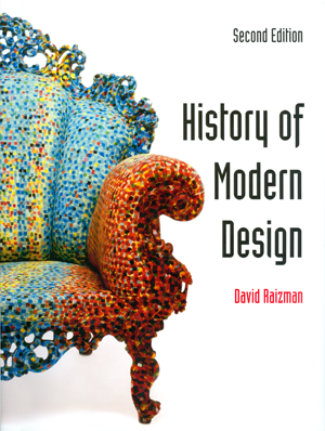
Alessandro Mendini’s 1978 Proust armchair:
Prentice Hall’s second edition (US) cover.
One Book, Two Publishers
19 June, 2012
Covers
Two new, different front covers for a 2nd edition to replace Fritz Hansen’s hard-to-better, first edition image of Arne Jacobsen’s Egg Chair.
For LKP’s version (from a number of alternative covers) I used ScalaSans, the same minimalist font used in the books Introduction text, with an image of counter-posed Verner Panton’s Stacking chairs. Although an entirely different image it keeps faith with the first edition’s abstract strength.
For Prentice Hall I used the book’s chapter titling, Brody’s Industria (here at full 100% black) with an image of Alessandro Mendini’s Proust armchair. Both picture and font embody modern design’s debt to history.
Body
To introduce, for both publications, new pictures and text, making alterations only where suggested improvements would be agreed by both publishers.
They agreed changes to the Part and Chapter opening titles from 25pt ScalaSans and 23pt Scala (roman) both to Neville Brody’s Industria Solid at 40 on 42pt at 40% black to lighten it’s weight, rather than use the Inline version.
The only other alteration was to the Scala body sub-heads, changed from bold, upper and lower case to light small capitals. This made the text more even, while retaining the distinction between body and headings. I reset the progressively cramped endmatter to avoid any text appearing smaller than 7pt.
Three examples of the alternative covers

George Carwardine’s 1935 Anglepoise lamp.
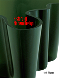
Alva Aalto’s 1936 Savoy vase.
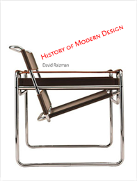
Marcel Breuer’s 1926 Wassily chair.
First edition cover
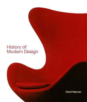
Fritz Hansen’s image of Arne Jacobsen’s 1958 Egg chair.Stiff competition for the second edition covers.
Four comparison pages

Second edition above, First edition below. Second edition, Part III title, 40pt Industria Solid.
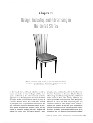
Second edition, Chapter title, 40pt Industria Solid.
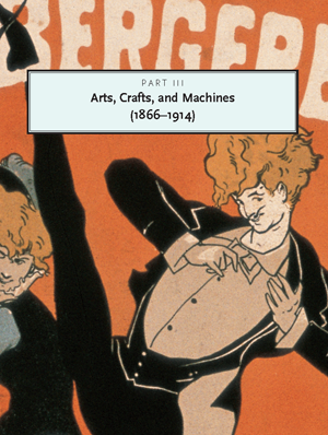
First edition, Part III title, 25pt ScalaSans.
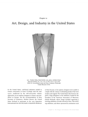
First edition, Chapter title, 23pt Scala (roman).
